

Most people who say they cannot find their shade have actually found their depth and missed their undertone. Depth is how light or dark the skin is. Undertone is the colour underneath it — and it is what makes a technically correct match still look wrong.
- Depth and undertone are separate variables; getting one right is not enough.
- The four categories that matter are cool, warm, neutral and olive.
- Test on the jaw and chest in daylight, never on the wrist or the back of the hand.
- Foundations oxidise — judge the match at thirty minutes, not thirty seconds.
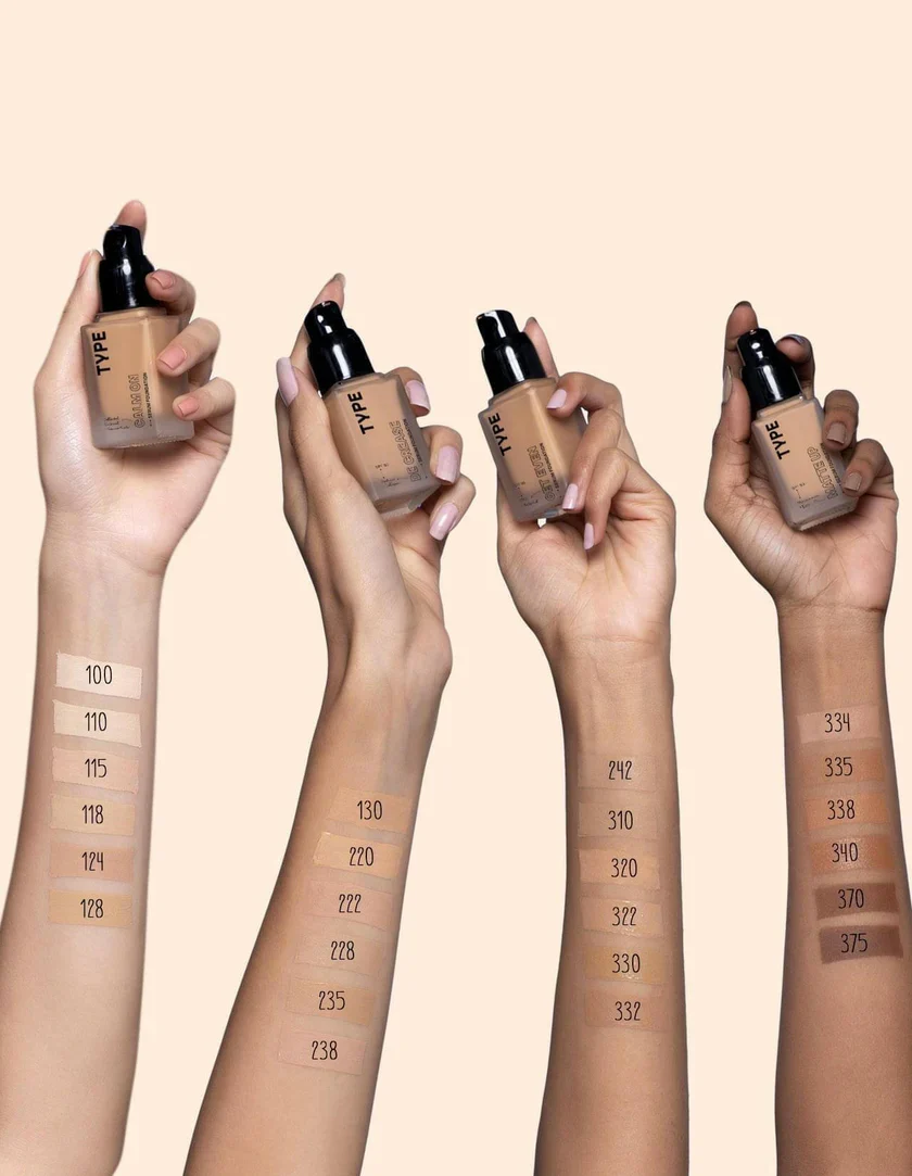
The four undertones
Cool skin has pink, red or bluish tones beneath the surface. It burns easily, often flushes, and looks best in silver jewellery and blue-based reds. Cool foundations are usually labelled with a C, R (rosy) or P (pink).
Warm skin runs yellow, golden or peachy. It tans more readily, rarely flushes, and looks best in gold jewellery and orange-based reds. Labelled W, G (golden) or Y (yellow).
Neutral skin sits between the two with no dominant cast. It suits both metals and tolerates a wider range of shades — which sounds convenient but actually makes matching harder, because too warm reads sallow and too cool reads grey with very little margin.
Olive is the category most often missed. Olive skin carries a green or grey-green cast independent of depth, and it exists at every depth from very fair to deep. Match an olive complexion with a standard warm foundation and it looks orange; match it cool and it looks ashy. Olive skin needs a foundation with green or khaki in the base, and the number of brands that make one is smaller than it should be.
Four tests, and what each is worth
The vein test — least reliable
The idea is that blue-purple veins indicate cool and green veins indicate warm. It works on very fair skin and becomes useless as depth increases, because the overlying pigment changes how the vein colour reads. Treat it as a weak hint, not an answer.
The jewellery test — moderately reliable
Hold silver against one side of your face and gold against the other in daylight. One will make the skin look brighter and clearer; the other will make it look tired. Silver flattering means cool; gold means warm; both looking fine means neutral. It is a genuinely useful test because you are comparing under identical light in real time.
The white paper test — good
Hold a sheet of plain white paper next to your bare, clean face by a window. The paper gives your eye an absolute reference. Against pure white, your skin will read pinkish (cool), yellowish (warm), greenish-grey (olive) or fairly balanced (neutral).
The swatch test — definitive
Nothing beats putting product on skin. Three stripes of three adjacent shades along the jawline, blended down onto the neck, viewed in daylight after thirty minutes. The one you cannot find is your shade.
Where to test — and where not to
| Location | Verdict | Why |
|---|---|---|
| Jawline into neck | Best | Bridges face and neck, which is where a mismatch becomes visible |
| Upper chest / décolleté | Excellent for events | Photographs show face and chest together; matching to the chest prevents the floating-head effect |
| Inner wrist | Poor | Rarely sees sun and is often noticeably lighter and cooler than the face |
| Back of hand | Poor | Usually more sun-exposed and darker than the face |
| Cheek | Misleading | Frequently the most flushed area, biasing toward cool |
Light matters as much as location. Store lighting is designed to sell, not to inform. Take the swatch to a window or, better, to the door and outside. If a brand will not let you step outside with a swatch on your jaw, buy elsewhere.
Oxidation — why the match changes
Many foundations darken and warm over the first half hour on skin. The pigment reacts with air and with your skin's own oil and pH. On oily skin the shift can be a full shade.
The practical consequence is that you must judge a match at thirty minutes, not immediately. A shade that looks a fraction too light when first applied is often exactly right once settled. If you match perfectly at the moment of application, you will frequently be too dark by lunchtime.
You can reduce oxidation by controlling oil at the source — a niacinamide serum, a gripping rather than oily primer — and by choosing formulations with a higher proportion of stable pigments, which tends to correlate with long-wear ranges.
Depth, and how to read a shade code
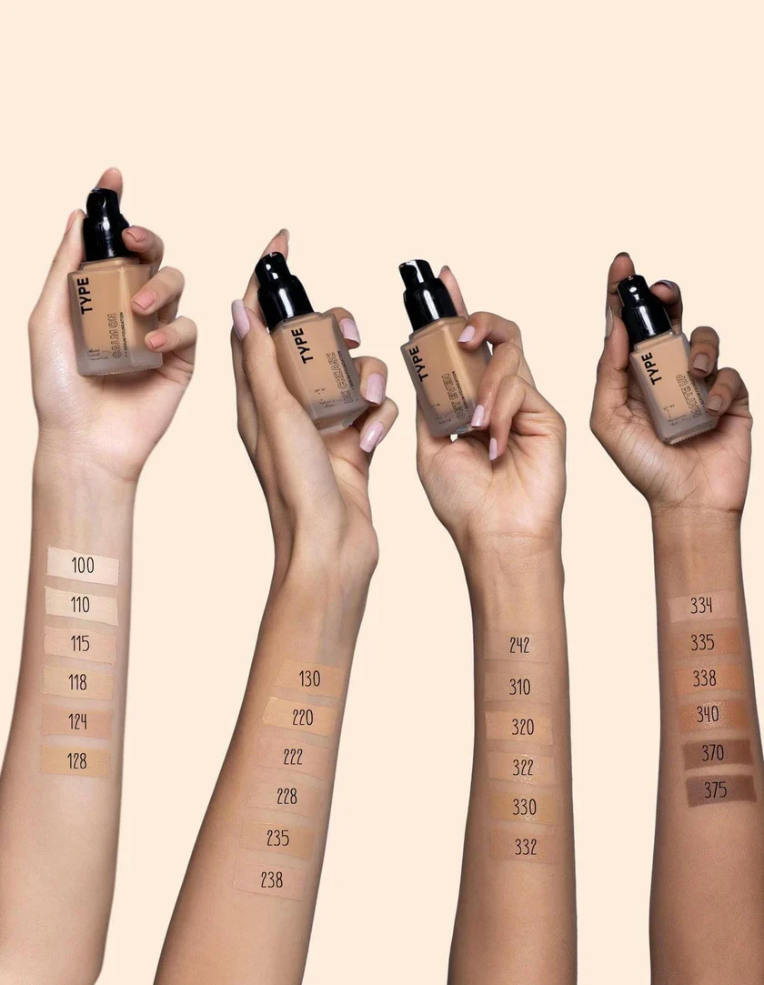
Most brands encode both variables into the shade name. Once you know the convention, shopping gets far faster.
- A number usually indicates depth, ascending from lightest
- A letter usually indicates undertone: C/R/P for cool, W/G/Y for warm, N for neutral, O for olive where offered
- So 3W and 3C are the same depth in different undertones — if your shade is close but looks sallow, you probably need the same number with a different letter, not a different number
Not every brand uses the same system, and some use none at all. Where a brand publishes a shade-finder tool with undertone filters, it is generally worth using as a starting point rather than a verdict.
Seasonal shift and the two-shade solution
Most people in South Florida change depth by one to two shades between winter and late summer, and undertone typically warms slightly with sun exposure as well.
Buying two foundations — your winter shade and your summer shade — and mixing them in changing proportions across the year is cheaper than it sounds, because each bottle lasts far longer. A 70/30 mix in spring and autumn covers the transitional months precisely.
The alternative is a shade-adjusting drop, which works well for depth but poorly for undertone. If your problem is that you go warmer in summer rather than simply darker, mixing two foundations is the better solution.
Common mistakes, ranked by how often they happen
- Matching to the face and ignoring the neck. The face is usually more sun-exposed and more flushed. Match at the jawline so the two meet.
- Choosing under store lighting. Cool-white retail lighting flatters cool shades and makes warm shades look muddy.
- Buying a shade too light to look brighter. It reads grey, and it makes the neck look dirty by contrast.
- Ignoring olive. If nothing has ever quite worked and everything reads either orange or ashy, this is almost certainly the answer.
- Judging immediately. Oxidation is real and thirty minutes is the honest test.
Undertone is far easier to demonstrate than to describe. In a studio lesson we swatch your current foundation beside two or three alternatives on your own jaw, in daylight, and the difference usually becomes obvious in about four minutes — after which you know what to look for permanently.
Questions we get asked
Undertone is largely fixed; depth changes with sun exposure. What feels like a change of undertone is usually a change of depth revealing that your shade was slightly wrong all along.
Buy both and mix, or buy the lighter one and adjust with bronzer. Between-shade is extremely common and mixing is the normal professional solution.
For localised concerns, yes — green over persistent redness, peach under blue-toned discolouration. As an all-over base layer they usually just complicate the match.
Book at the studio in West Palm Beach and we will work through it in person — including the parts that are easier to show than to describe. Call (323) 994-4225 or request an appointment.